To see what you want your customers to see, feel what you want your customers to feel, and to do what you want customers to do colors plays an important role.
Cadbury being my one of my favorite brand of all times always gave me a thought why that brand chose rich purple as it´s packaging color, very few food brands actually chose colors like purple. It is mysterious to know that purple is a low arousal color, it is traditionally associated with royalty, majesty or nobility as well as having a spiritual or mysterious quality. Purple is best used for targeting a female audience, it doesn’t even rank for men. Although royalty and value can be seen as positive associations, they also have negative connotations, and can often communicate hastily.
Cadbury chocolate uses a dark rich purple associating their brand with luxury and quality. It’s aimed not only for children but also at the adult market. It’s not difficult to imagine indulging yourself with chocolate and getting lost in daydreaming…. Wearing Cadbury’s purple shade would probably be a fashion faux-pas.
Purple logo shows that your brand is luxurious and imaginative. Purple also represents high end products, the most expensive properties on Monopoly, Park Lane and Mayfair both had purple cards. It attracts consumers who want to be seen as wealthy or wise, as well as ones who are inclined towards a feeling of magic or mystery.


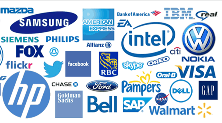
Blue creates a sense of security and trust in a brand. People are 15% more likely to retain your shop if it’s painted blue. It’s also associated with productivity, and it’s non-invasive. Blue’s sense of confidence is what makes it the favorite color used by financial institutions. The color is also known to inspire loyalty. The JP Morgan, Facebook, American Express, LinkedIn, and Dell use this color on their brands. But also the colors blue and purple have been associated with toxins and thus decrease the appetite of customers. Yet, if you notice Cafe coffee day uses the color blue, reason being blue is generally linked with relaxation. So if someone owns a coffee house where you want people to have a relaxing time and enjoy their beverages, blue and purple are your colors. Cafe Coffee Day makes abundant use of the color purple too and is one of the most popular coffee destinations in the country. On the contrary Starbucks another popular coffee destination uses green color in their logos. Starbucks’ green continually communicates ideals of calmness and sophistication, Starbucks’s green is also intended to promote international peace, not to mention stability and consistency in their product, amounts of green on their walls becomes a symbol of comfort for many people allowing them to de-stress.
Moreover, a green logo conveys the message that your company is environmentally friendly. It explains why it is so popular with organic and vegetarian brands, as well as companies that strive for ethical practices. It can also be a good choice for financial companies, since it reminds consumers of money.
Did you ever noticed from famous food brands to the brands commonly known to us lies one similarity that is the color red. From Coca-cola to KFC, Canon, Kellogg´s, Red Bull to Nestle preferred using the color red in their company logos. The color red attracts attention and evokes strong emotions from viewers.
It also causes increased heart rate and appetite, as well as a sense of urgency. That is the trick that food houses play with us. Also, brand logos in red are no doubt memorable. Red logos grab customer attention, and if you want to attract your target market towards your brand, use the color red.

Isn't it interesting that the word sale is mostly written in red creating a sense of urgency to buy. The color red excites our emotions and inspires us to take action.

McDonald´s on the other hand uses yellow along with red, Yellow represents optimism, youthfulness, creates an atmosphere of positivity around the brand, it is also used to highlight the brand, you can easily detect the M of the logo from quite a far distance.

IKEA's founder select the colors from his country's national flag - Sweden.IKEA definitely uses their brand colors for full effect with their store exteriors in yellow and blue. Although Ikea brand colors are symbolic, the psychological properties of these colors are still in play. The staff are very helpful and happy. They also use a dark blue representation trust, communication and loyalty. Yellow logos generally shows that the brand is friendly. It’s also used to grab the attention of window shoppers. Although too much yellow causes' anxiety, using right proportion is much need.
Yellow not only highlights, but also it gives a sense of caution in our mind, it aware our mind, that´s why it is widely used in roads.
Another trick with colors that company plays all year long and it works all year long too is with orange and black. Orange is thought to represent playfulness, creativity, and excitement, which is why it is often used by children’s brands and companies hoping to appeal to young people, such as the kids’ cable channel Nickelodeon. Orange is also believed to stimulate an appetite or thirst — likely due to the color’s connection to citrus fruits. Mystery and darkness are perhaps the most obvious associations with the color black — especially during October. But black also signifies elegance, timelessness, sophistication and prestige. Orange and black are a striking combination — just look at a monarch butterfly or a tiger to see how incredible this pairing can be. Exciting, energetic orange plays off of sophisticated and reserved black. This type of contrast can be very powerful, conveying nuances of your brand’s personality while evoking multiple emotions from your audience.

As we have already said color speaks, it depicts this company is dominant but approachable. Amazon arrow-smile is intended to “communicate the company’s mission of being the most customer-centric company in the world, most notably by depicting the ultimate expression of customer satisfaction: a smile.” Similarly,

It says this is a company that you can get excited about because it empowers you.
Black is perfect for a credit card company like Discover because the color represents power and stability. The term “in the black” means that something is financially sound. The orange, spherical “o” in the logo — reminiscent of a sun — adds energy and excitement, and emphasizes all the possibilities available with a Discover card. Putting it together we’ll notice that they don’t strictly or even overwhelmingly favor one industry and yet, the color combination is a fitting reflection of each brand because the designers paid close attention to what these colors signified.
Black being the my personal favourite color speaks a lot when it comes to business,


may be 3 brand examples are enough to depict about this color and what it depicts. To clarify more this is the color of sophistication, mystery, power and control. It’s the color used to sell sleek items, and brands sold to those who like reserved brands. It mostly dominates the high-end cosmetic packaging industries. Black is used to commonly target youth and a high-end audience. When used too much it can be subliminally repulsive as it will denote negativity and oppression.

Lastly, comes the most clean color.....obviously it´s white. It’s the most common color used by marketers when advertised coupons and price discounts.Some of the biggest global brands like Google use white to create contrast on their home pages. White is the color of clarity, freshness and used to spark creativity. That’s why it’s the most common color in office blocks. .We all might be thinking now why google is using so many colors in itś logo?? Logic being they are the base colors (red, blue, yellow), but they used the “green” -which is a secondary color,- as well with the idea of showing that Google isn't following the rules, it's not a conventional company.
The markets have become more competitive, and product cycles have shortened, and therefore every marketer has to exploit each rule in the book in order to generate sales. At the end of the day, every firm has to think through how their brand colors affect customer reaction and the eventual sales.


 McDonald´s on the other hand uses yellow along with red, Yellow represents optimism, youthfulness, creates an atmosphere of positivity around the brand, it is also used to highlight the brand, you can easily detect the M of the logo from quite a far distance.
 As we have already said color speaks, it depicts this company is dominant but approachable. Amazon arrow-smile is intended to “communicate the company’s mission of being the most customer-centric company in the world, most notably by depicting the ultimate expression of customer satisfaction: a smile.” Similarly,

 Lastly, comes the most clean color.....obviously it´s white. It’s the most common color used by marketers when advertised coupons and price discounts.Some of the biggest global brands like Google use white to create contrast on their home pages. White is the color of clarity, freshness and used to spark creativity. That’s why it’s the most common color in office blocks. .We all might be thinking now why google is using so many colors in itś logo?? Logic being they are the base colors (red, blue, yellow), but they used the “green” -which is a secondary color,- as well with the idea of showing that Google isn't following the rules, it's not a conventional company.