Saturday, 27 April 2019

Speak Through Your Eyes

What is the first thing that attracts you in a person?

First thing that attracts me in a person is their eyes. As, a keen observer it always attracts me whenever I meet a person.
People say that the eyes are a “window to the soul” - that they can tell us much about a person just by gazing into them.
Look into your friend’s eyes while you are speaking and observe the pupil your half the conversation will be done.
Did you ever noticed whenever you are speaking to a particular person their pupils get dilated always?
If you find the other person is having a dilated pupil or widening their eyes while speaking or listening to you. It is a major signal whether they are interested in what you are is saying. Pupils will dilate and continue to dilate if the person is interested in the topic. However, not only the conversation it also signifies that a person got interested in talking to you or not. Simultaneously, when talking to the clients and customers looking at their pupil we can make out whether they find it exciting or interesting if not then that's a time we should change the topic and tell something of their interest.
Many a time's pupil also dilate when there is a shock or but contracts simultaneously as they recover their shock, but that dilation lasts for long.
Similarly, pupils contract when they are least interested to talk to you and will try to avoid by blinking or rubbing eyes.
Taking this as an advantage advertiser almost always widen the pupils of women in their ads because it makes their product look arousing and welcoming, so in many beauty apps we find a special feature for widening pretty eyes.
It's just not to make you feel beautiful, it is a game of human psychology. Mostly, you will also observe that those pictures in social media is liked by many.
However, since our childhood we have all learn about the eye directions let see again the meaning of it:
Looking to Their Right symbolizes auditory thought (Remembering a conversation)
Looking to Their Left symbolizes visual thought (Remembering the face of a person)
Looking Down to Their Right symbolizes someone creates a feeling or sensory memory. (Day dreaming which never comes true)
Looking Down to Their Left symbolizes someone talk to themselves (which we always do).
Most insecure activity people I don't like personally is when the other person starts gazing.
Gazing is to look steadily and intently at something, especially at that which excites admiration, curiosity, or interest. It was found that people gaze more at the eyes of the people they like. While normal people would look in your eye for some time then shift their gaze away each few seconds a person who likes you will keep looking into your eyes for longer periods of time.
However, in print media it is being observed that when the model's gaze was directed at the product, participants spent longer looking at the product, the brand logo and the rest of the advertisement compared to when the model's gaze was directed towards the viewer.
Although, it is always being a big controversy among people between the asymmetry between male gaze and female gaze.
Gazing can be an intimate activity. In fact, if you disagree with a superior, you can show disagreement by holding your gaze for a bit longer than normal.
There are three types of gazing:
1. Social Gazing – This is a triangle from the eyes to the mouth. It is non-aggressive and shows comfort.
2. Intimate Gazing – If you want to be intimate with someone, you want to look from their eyes to their mouth and lower to the body. If someone is doing this to you, it usually means they are having intimate thoughts about you.
3. Power Gazing – This is a triangle between the eyes and the forehead. It avoids the intimate areas of the mouth and body completely.
However, it is also common to blink a lot when we interact with someone we like or when we are thinking about many things at the same time. Therefore, when reading emotions through someone’s eyes, it is important to focus on the context or the conversation that is going on at the same time.
However, on our daily life we have people around us who wants to see us laughing that's why they will give you a quick look after they say anything funny just to make sure that you are laughing or that his joke appealed to you.
Let's not waste our time peeping at our mobiles every second rather start looking at opposite person's eyes half of our conversation will be done.

Sometimes, our eyes speak louder than our words and it cannot be controlled.


Image result for eyes psychology facts

Thursday, 14 February 2019

Tinder Slowly Crawled and Right Swiped Instagram

Valentines's day just got better with Tinder, Grindr, Her, Bumble, or whatever other apps meeting up for all your dating needs.

Surprisingly, if it is being noticed as soon as you post a new picture people started magically in boxing out-of-the-blue. These persons are mostly unknown or people whom we don't have contact for year. Feel like texting “ Hey are you still try to find out am I single or not?”. Virtual Relationships are playing a big role in people's life. In reality, it is very hard to approach a person and tell “ Hey! Will you go on a date with me”. Understanding these need of the people dating app like Tinder came up. Just a swipe and you can tell other person you like their profile and if that person also like a swipe and yippee it's “Match” without getting nervous, biting your nails, buying roses or getting costly gifts.... Isn't that easy! However, if the person you like doesn't like you, that's OK at least the other person is not getting insulted and also no one will know about it. For the stalkers there is a new game, "The Game of Instagram ", yes, Tinder slowly crawled to Instagram and right swiped. The dating app integrates the popular photo service app into its user profiles. Now, Tinder user can see the Instagram profile with 34 recent pictures on Instagram. Also, there is an option to keep the Instagram account private someone doesn't want to portray in Instagram. However, in private Instagram account we call only show few pictures which we want our Tinder stalkers to see. Taking this as an advantage many stalkers first find the name on Tinder and after that DM in the person inbox(Just to start a conversation, to find if there is any chance), even if the person left swiped on Tinder showing no interest in opposite person. Tinder also displays all of a user’s Facebook interests, as opposed to just sections, and, as well as mutual friends, Tinder now also displays friends-of-friends. “If we can provide our users with more relevant information for each connection, we can take them halfway there in terms of getting a conversation going”, said Tinder’s co-founder and president Sean Rad. Tinder seems to be a modern day “Virtual Pandit” which not only helps to meet new people, but also takes care of matching our interests. Tinder profiles comes after the app launched a premium service, Tinder Plus & Tinder Gold. The services came under fire for being priced according to a user’s age. However, If you’re a man, 100 swipes isn’t that many. On average men get far fewer matches than women, so 100 right-swipes a day may not get you many matches. If you have Plus you can swipe away to your hearts content. It’s not truly unlimited even though it claims to be; if you do 2000 or so right swipes (or 2000 votes, can’t remember) in a day then it disables your queue for a while. But you’d have to be on it a lot to actually reach that limit. It also enables you to change your location to anywhere in the world you like and you can swipe on people in that location, who will also be able to vote on you as if you were actually there. This is handy if you’re going on holiday somewhere — you can set your location to there in advance of going, swipe on a bunch of people and hopefully set up matches. I like the fact you can undo your previous swipe.
Sometimes our fingers move faster than your brain!
Image result for instagram left swipe

Thursday, 15 November 2018

Game of "ODD"


Think of your favourite number.....
Is it no. 7 or any odd no. ????

I guess so, now think of the no.of mannequins you see inside the store specially outside the store. Is it odd.

Yes, it is !! And if it is not then the shopkeeper has enough sales and is confident that targeted customers will enter the store anyway.

This is because it creates asymmetry in the display, drawing the customer's attention. This is because when people look at symmetrical and balanced objects, their gaze moves away quickly because it seems to be normal; asymmetrical or unbalanced displays are thus “abnormal” and are more interesting to the eye.
mannequin in malls এর ছবির ফলাফলmannequin in malls এর ছবির ফলাফল

The off-balance that this odd number forces the customer to gaze at the different aspects of the display, focusing on each on separately rather than have their eye take in the whole display at once.

People also tend to remember thing in group of 3 or odd in no.

Also, when shops place odd no. of mannequin generally 3, they tend to keep those many odd features may be and one and when you will look for detailing you will find one attractive among it and will focus on one which you want to buy. It just create a sense of comparison if they keep different features.

Another psychological trick of odd no. is while we are presenting something to anyone we should find odd no. of uses for that product and specially if it is done by hand symbols or with 3 product display the opponent gets more attracted and it rouses the interest.

Symmetry is pleasing to human beings, but it is also boring.

Moreover, in our personal life we tend to be more curious about thing which are happening in odd no.s. Suppose in an occasion we are seeing bunch of people enjoying and there is guy standing alone we are more interested to know why that person is standing alone rather than what the group is doing.
odd one in group এর ছবির ফলাফল

A slight deviation in a symmetrical display catches people's attention and could make the entire tableau more exciting.

Do you remember that our land line no. used to be 7 digits because it was easy to remember and we usually tend remember last 3 digits of those 7 no.s.

It’s said that odd numbers are considered to be masculine and even numbers are more feminine. Whether it’s because, for the most part, odd numbers tend to have a sharper, “edgy” shape, and even numbers are curvier. Eg: Elle 18, Three Amigos etc.
elle 18 logo এর ছবির ফলাফল


And, then comes the number eleven and it’s “stand out” vibe. Adding the extra digit to an otherwise clean-looking number can achieve the same effect. Eg: KFC’s 11 secret herbs & spices or Levi’s 501 Jeans the extra one helps the brand to stand out, allowing to it become more memorable instead of easily dismissive.

kfc 11 herbs and spices এর ছবির ফলাফল

Take 2 pencils in front of you, Is it appealing to you?? I guess no. Now, take 3 pencils in front of you, you will now tend to look for a detail of those pencil.

So, odd is just not odd but also it's powerful.

Sunday, 23 September 2018

The Apsara and Nataraj Story


What was your age when you realise that Apsara and Natraj pencils are from same company??

An enduring memory from our childhood is an advertisement in which different pencil brands race each other, with the Natraj pencil emerging the winner and the tagine ‘Natraj phir se champion’ proclaimed. But my personal favourite being Apsara Extra Dark pencils which ensures a good handwriting and an extra 5 marks (Which I needed the most).
Both the brands captured the essence in their own way be it Natraj ad which ensures the pencil gave a better grip, it would not break and it would write for a longer period than all the rest, it wouldn’t smudge, the lead was blacker and clearer, and the flow, smoother Or the Apsara with the dark edge look.
Hindustan Pencils Ltd follows a dual-brand strategy in the market. The dual-brand strategy is using two independent brands (or sub-brand) to cover the market.
I still remember it is always a fun to find out after sharpening our pencils that it has got pointy points or not, which the brand promises. Natraj and Apsara together control 60-65% of the pencil market in India.
The company’s dual brand strategy of having two independent brands offering almost the same range of products was an intelligent move both the brands have the same range of products that include pencils, erasers, sharpeners, pens, etc. Apsara has a good range of professional and drawing pencils. Apsara Pencils are priced higher than Natraj and offer more options. Nataraj is positioned as a brand that offers long-lasting quality at an affordable price. Consumers from different backgrounds, professionals and others, are thus covered and any competition from other brands is pushed to second place.
There were both advantages and disadvantages of having dual-brand strategy. For covering the different segments of consumers and good no. of consumers the strategy is effective. A kid and their parents they remain in a dilemma which pencil will be best and fetch “extra marks” with a “good handwriting”. Also, there were no positioning conflicts as two brands are independent. Moreover, it will create a tough competition for new entrants. It promotes its products among children by conducting inter-school contests and different programs for students.


Although it's users vary from students to architects, carpenters, artists and office-goers, who still use the pencil for various jobs such as writing, drawing, colouring, sketching and shading, thus making the stationery industry one that is still thriving despite the advent of tabs and laptops.
Hindustan Pencils has also diversified into manufacturing crayons, geometry sets, professional pencils, gel and ball pens, chalk, colouring sticks and chalk paints — almost the entire range of writing equipment, to be exact.
The company has gone in for backward integration to produce even the smallest components — such as sharpener blades, screws and pen tips — in-house, to keep to its own standard of delivering only the highest quality and also higher profit margin.

Thursday, 13 September 2018

A Viral Too Costly


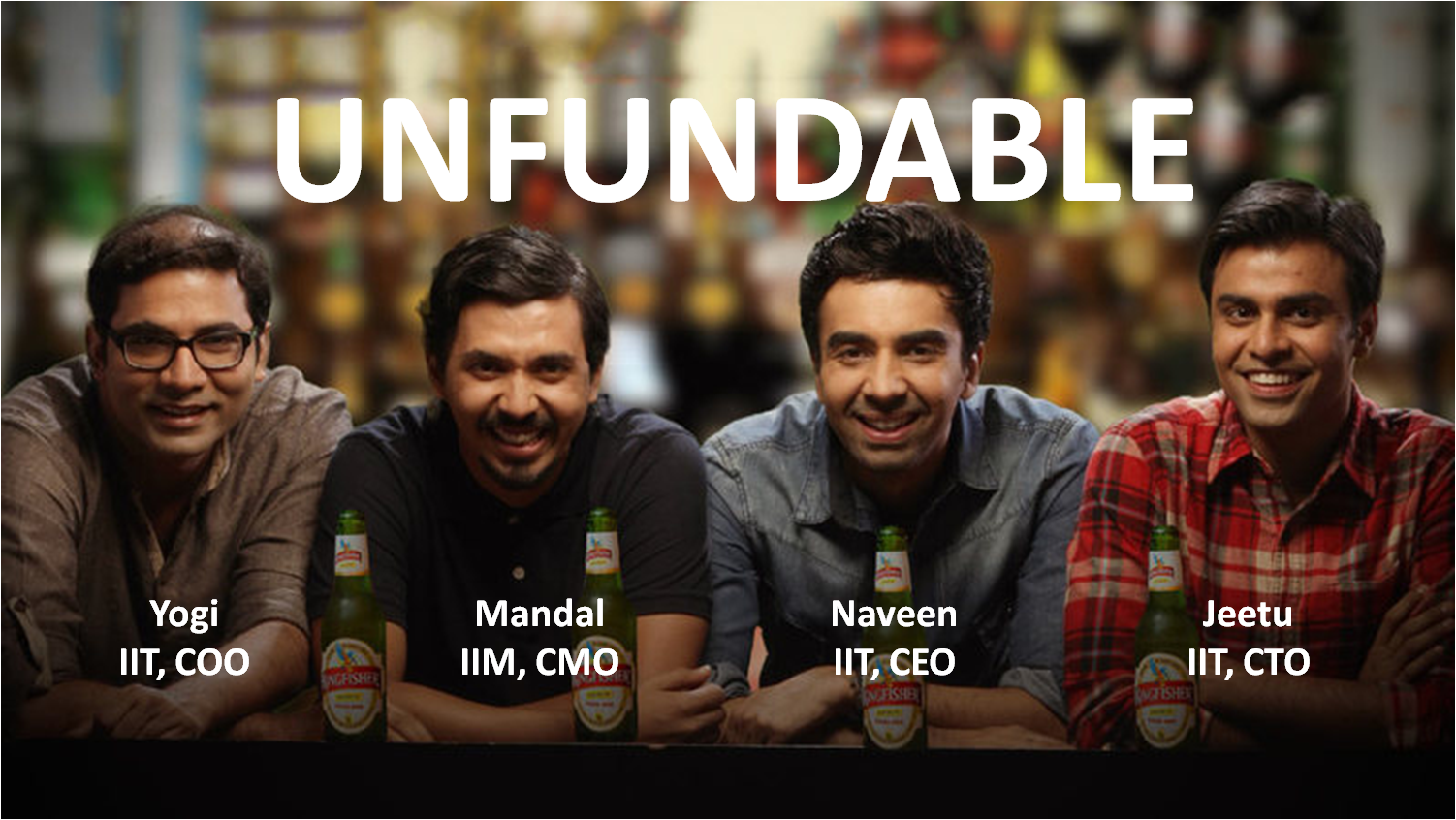
As a regularly tuned viewer of entertaining and engaging videos and as marketing student, I always wondered how one of my favourite YouTube channel TVF earns money. Is it just by selling ads and increasing no. of views and subscriber.

As a single camera costs around 4-5 lakhs and with single camera it is very difficult to shoot these videos, there will be location cost, salaries for full team (actors and staffs) along with various other costs.

Will that money for ads and views is enough for all this?????

Digging into this a little more I found an interesting story.
1. TVF had received a funding of 10 million dollars and it is now a 270 Cr business in 2016. But, this company has been established on 2010 how did they sustain this 6 years. So, after repeating this series I realised all the series are sponsored series if you look more keenly they use some products in their show or products are generally kept at background that knowingly unknowingly we seem to see and recognise those products. Unknowingly their product placement is done.
Though till pitchers they have not received any big funding it is funded from their home, but their establishment and the quality of video have actually raised interest among investors to invest in them.

Interestingly!! TVF Pitchers is also based to start-up struggling hard for funding.

2. TVF series was on YouTube primarily but slowly they built their base of subscribers and viewers and shifted them to sign in to their application and website. Also, expenses for apps are much less than YouTube, Smart!! isn't it.

Again, it happened because the youth felt TVF series is very similar to their life, they feel the connectivity and as usual if we see 1 episode our hunger for it doesn't satisfy and automatically sign in TVF website to watch full series.

3. TVF Play now shows 3rd party movie and movie which the youth generally like, if you realise it is slowly becoming the next Netflix of India with a similar website design.

4. Even they have partnered with Ola so while travelling in Ola Prime the screen in front of your seat in cab will have TVF Play options. Which youth will generally tend to choose if they are travelling for longer distance and an addict of web series like me.

tvf এর ছবির ফলাফলIndeed, Arunabh Kumar, the founder of TVF has appropriately designed his business model with proper brand integration inspiring others and showing them new ways of doing business and how a small YouTube channel is becoming India's new Netflix.

Thursday, 1 March 2018

COLOR TAILS


To see what you want your customers to see, feel what you want your customers to feel, and to do what you want customers to do colors plays an important role.
Cadbury being my one of my favorite brand of all times always gave me a thought why that brand chose rich purple as it´s packaging color, very few food brands actually chose colors like purple. It is mysterious to know that purple is a low arousal color, it is traditionally associated with royalty, majesty or nobility as well as having a spiritual or mysterious quality. Purple is best used for targeting a female audience, it doesn’t even rank for men. Although royalty and value can be seen as positive associations, they also have negative connotations, and can often communicate hastily.
81 Color Meanings in BusinessColor and Meaning in Business Branding
Cadbury chocolate uses a dark rich purple associating their brand with luxury and quality. It’s aimed not only for children but also at the adult market. It’s not difficult to imagine indulging yourself with chocolate and getting lost in daydreaming…. Wearing Cadbury’s purple shade would probably be a fashion faux-pas.
Purple logo shows that your brand is luxurious and imaginative. Purple also represents high end products, the most expensive properties on Monopoly, Park Lane and Mayfair both had purple cards. It attracts consumers who want to be seen as wealthy or wise, as well as ones who are inclined towards a feeling of magic or mystery.


Related pictures


Pictures of ccdPictures results of starbucks

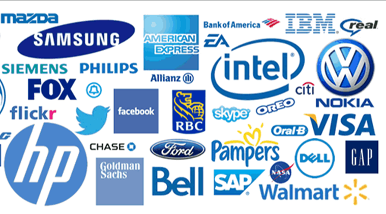
Blue creates a sense of security and trust in a brand. People are 15% more likely to retain your shop if it’s painted blue. It’s also associated with productivity, and it’s non-invasive. Blue’s sense of confidence is what makes it the favorite color used by financial institutions. The color is also known to inspire loyalty. The JP Morgan, Facebook, American Express, LinkedIn, and Dell use this color on their brands. But also the colors blue and purple have been associated with toxins and thus decrease the appetite of customers. Yet, if you notice Cafe coffee day uses the color blue, reason being blue is generally linked with relaxation. So if someone owns a coffee house where you want people to have a relaxing time and enjoy their beverages, blue and purple are your colors. Cafe Coffee Day makes abundant use of the color purple too and is one of the most popular coffee destinations in the country. On the contrary Starbucks another popular coffee destination uses green color in their logos. Starbucks’ green continually communicates ideals of calmness and sophistication, Starbucks’s green is also intended to promote international peace, not to mention stability and consistency in their product, amounts of green on their walls becomes a symbol of comfort for many people allowing them to de-stress.
Moreover, a green logo conveys the message that your company is environmentally friendly. It explains why it is so popular with organic and vegetarian brands, as well as companies that strive for ethical practices. It can also be a good choice for financial companies, since it reminds consumers of money.
Pictures results of blue logos


Did you ever noticed from famous food brands to the brands commonly known to us lies one similarity that is the color red. From Coca-cola to KFC, Canon, Kellogg´s, Red Bull to Nestle preferred using the color red in their company logos. The color red attracts attention and evokes strong emotions from viewers.
It also causes increased heart rate and appetite, as well as a sense of urgency. That is the trick that food houses play with us. Also, brand logos in red are no doubt memorable. Red logos grab customer attention, and if you want to attract your target market towards your brand, use the color red.picture results of sale picturesIsn't it interesting that the word sale is mostly written in red creating a sense of urgency to buy. The color red excites our emotions and inspires us to take action.

Pictures of Macdonald's resultsMcDonald´s on the other hand uses yellow along with red, Yellow represents optimism, youthfulness, creates an atmosphere of positivity around the brand, it is also used to highlight the brand, you can easily detect the M of the logo from quite a far distance.
Image results of ikea IKEA's founder select the colors from his country's national flag - Sweden.IKEA definitely uses their brand colors for full effect with their store exteriors in yellow and blue. Although Ikea brand colors are symbolic, the psychological properties of these colors are still in play. The staff are very helpful and happy. They also use a dark blue representation trust, communication and loyalty. Yellow logos generally shows that the brand is friendly. It’s also used to grab the attention of window shoppers. Although too much yellow causes' anxiety, using right proportion is much need.
Pictures of taxi resultsOla's picture resultsImage results for road symbols

Yellow not only highlights, but also it gives a sense of caution in our mind, it aware our mind, that´s why it is widely used in roads.
Another trick with colors that company plays all year long and it works all year long too is with orange and black. Orange is thought to represent playfulness, creativity, and excitement, which is why it is often used by children’s brands and companies hoping to appeal to young people, such as the kids’ cable channel Nickelodeon. Orange is also believed to stimulate an appetite or thirst — likely due to the color’s connection to citrus fruits. Mystery and darkness are perhaps the most obvious associations with the color black — especially during October. But black also signifies elegance, timelessness, sophistication and prestige. Orange and black are a striking combination — just look at a monarch butterfly or a tiger to see how incredible this pairing can be. Exciting, energetic orange plays off of sophisticated and reserved black. This type of contrast can be very powerful, conveying nuances of your brand’s personality while evoking multiple emotions from your audience.Image results of amazon As we have already said color speaks, it depicts this company is dominant but approachable. Amazon arrow-smile is intended to “communicate the company’s mission of being the most customer-centric company in the world, most notably by depicting the ultimate expression of customer satisfaction: a smile.” Similarly,


It says this is a company that you can get excited about because it empowers you.
Black is perfect for a credit card company like Discover because the color represents power and stability. The term “in the black” means that something is financially sound. The orange, spherical “o” in the logo — reminiscent of a sun — adds energy and excitement, and emphasizes all the possibilities available with a Discover card. Putting it together we’ll notice that they don’t strictly or even overwhelmingly favor one industry and yet, the color combination is a fitting reflection of each brand because the designers paid close attention to what these colors signified.

Black being the my personal favourite color speaks a lot when it comes to business, Gucci's picture results

Image results of addidaspictures of mac cosmetics results may be 3 brand examples are enough to depict about this color and what it depicts. To clarify more this is the color of sophistication, mystery, power and control. It’s the color used to sell sleek items, and brands sold to those who like reserved brands. It mostly dominates the high-end cosmetic packaging industries. Black is used to commonly target youth and a high-end audience. When used too much it can be subliminally repulsive as it will denote negativity and oppression.
Pictures of brands in blackLastly, comes the most clean color.....obviously it´s white. It’s the most common color used by marketers when advertised coupons and price discounts.Some of the biggest global brands like Google use white to create contrast on their home pages. White is the color of clarity, freshness and used to spark creativity. That’s why it’s the most common color in office blocks. .We all might be thinking now why google is using so many colors in itś logo?? Logic being they are the base colors (red, blue, yellow), but they used the “green” -which is a secondary color,- as well with the idea of showing that Google isn't following the rules, it's not a conventional company.
Google Image ResultPictures results of coupons and discounts
The markets have become more competitive, and product cycles have shortened, and therefore every marketer has to exploit each rule in the book in order to generate sales. At the end of the day, every firm has to think through how their brand colors affect customer reaction and the eventual sales.